Meredith Pritchard is a San Francisco based designer with an interest in graphic and web design as well as advertising.
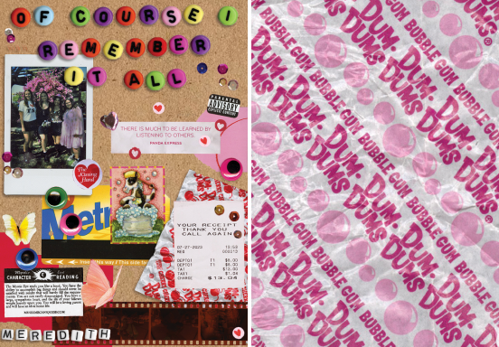
Of Course I Remember It All
Fall 2023
Course: Typography
This design, featuring my own 6 word memoir, reads: “of course I remember it all.” I am someone who holds on to physical items and scrapbooks monthly as a way to recall memories. Done in a similar style to my scrapbooking spreads, I scanned lettered beads, tickets, polaroids, and other items I’d put in my scrapbook to further illustrate this idea of memories that’s featured in my memoir.
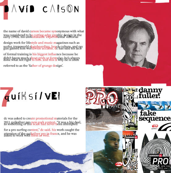
David Carson Accordion Book
Spring 2023
Course: Visual Communication I
This book examines the style and work of famous grunge designer David Carson. I’ve always admired David’s style and background as a designer, so I tried to replicate it while still making the content legible by playing with digital aspects of design like transparency and non-digital aspects like incorporating the texture of sand and crumpled notebook paper. After completing the design, I printed and bound the book in an accordion style.
Lovey Tattoo
Spring 2023
Course: Visual Communication I
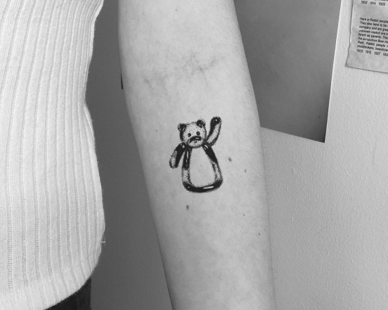
The goal of this assignment was to digitally design a tattoo for ourselves. The subject of this design is Lovey, my childhood stuffed animal, because if I were to ever get a tattoo, I’d want it to have a deep and personal meaning. A stippling style was created using the pen tool on Illustrator due to a personal aversion to harsh contour lines–especially in tattoos. In this photo, the final design has been photoshopped onto my arm.
Crissy Field Icons
Spring 2023
Course: Visual Communication I
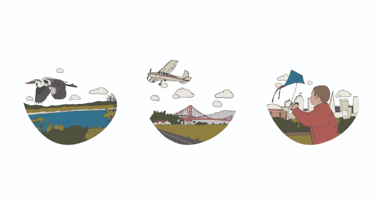
I was tasked with creating 3 visually cohesive icons for a San Francisco-related landmark/object/idea for this assignment. The icons represent different forms of flight in Crissy Field while referencing its past (the Ohlone tribe and Crissy Airfield) and present. The images were made using the image-trace tool over my own drawings on Illustrator, and the colors were extracted from photographs I had taken in the area.
One Step Closer to A Better Lifestyle
Spring 2023
Course: Visual Communication I
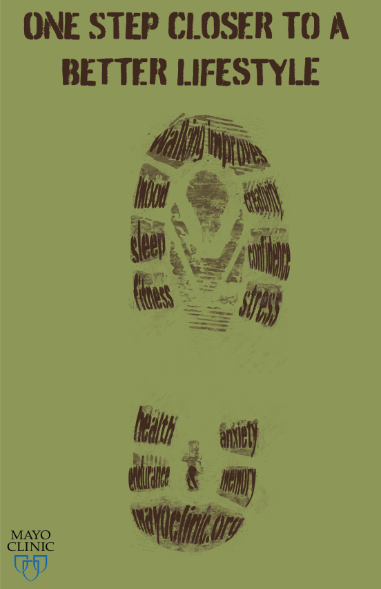
This poster expresses the mental and physical benefits of regularly walking. We were asked to pick a topic to create a PSA for, and I landed on walking after spending a week in COVID isolation. During my isolation period, I found that walking outdoors really improved my mood and creativity. I’ve always been drawn to handmade typefaces out of ordinary objects, so I tried to incorporate this into the PSA by finding a font that looked like dirt, and I distorted it and added a few details to make it look like a shoe print to further push the idea of exercising outdoors.
Typographic Arrangements
Fall 2023
Course: Typography
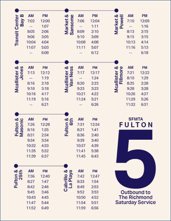
The content and compositions contend with a diversity of subject matters, mediums, typographic arrangements, hierarchy of information, and underlying text/grid structures. This series serves to catalog a foundational understanding of how text and composition come together to create meaning and interest. These type studies also establish an understanding of typographic experimentation, functionality, and working within visual constraints/systems.
The Feed
Fall 2023
Course: Visual Communication
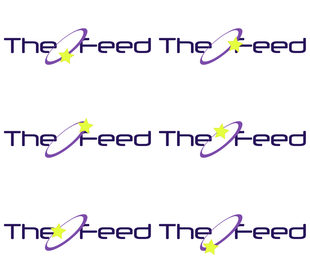
This hand-coded website explores how I use technology on a day-to-day basis. The format of this site mimics familiar social media platforms such as Instagram and Twitter. This project allowed me to learn more about web design by using HTML and CSS.
All Bite No Bark
Spring 2024
Course: Branding and Packaging
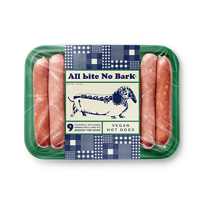
All Bite No Bark is a vegan hot dog brand I created the brandign and packaging for. Everything from the logo, typography, and color scheme was carefully picked to best represent the brand tone and values.
